October 10, 2009
In my final year in graduate school I learned about a group called the Situationist International and I became fascinated with their imaginative imagery that drew from architecture and art. I was interested in their concepts of urbanism, the city and Marxism as a creative apparatus. Like the artists in the Chance Aesthetics exhibition, the work and their concepts are rather playful and I think are a reaction to the horrors of the destruction of cities and deaths of millions during World War II. This was their vision of post-war utopia.
Metabolic City focuses on mainly three different groups working at relatively the same time; 1950s-1970. The British architectural group, Archigram, the Japanese Metabolists, and the Situationist International (SI) (mainly Constant Nieuwenhuy). The exhibition consists of montages, diagrams, architectural rendering, videos that are projected on glass while you sit in a cockpit type module, and models.
All three groups think of the city as a living organism that is flexible, mobile and expandable. They all had their views on economic systems that seemed to permeate their work. They all seemed to embrace technology as a way to make life better. For example, Archiagram and the Metabolists embraced consumerism and mass pop culture. Whereas the SI was very critical of capitalistic society. Their goal was to revolutionise space and mass culture through Marxist revolution. They wanted to liberate man from the confines of capitalism and mass culture. They envisioned urban space as an experimental arena for human interaction and self-realization. In simple terms, let’s think of the SI as socialists and Archigram and Metabolists as capitalists.
The Metabolists
After WW2, Japan was going through social, political and cultural changes. They drafted a new constitution and made dramatic changes in regard to land use. Looking for a positive identity and individual rights led to visions of he city based on metaphor of life cycles. They proposed new territories of inhabitation such as the ocean and social spaces gained prominence. There work defiantly has a biological and natural element to it. Some of it looks like part of living creature or is just closely tied to the natural environment.
Those included are Kisho Kurokawa, Fumihiko Maki and Arata Isozaki

Kisho Kurokawa diagram

Fumihiko Maki model

Arata Isozaki photomontage
Archigram
This was a British group in which the members were fresh out of school. They were not too interested in politics and were more enthusiastic about the social aspects of built space and broader issues of urban livability. They were brough up in a time when destroyed cities were being rebuilt in short spans of time and lacked a sense of the vitality found in a living city. Seeing this and the desire for a better life spurred them to push the limits of architecture. Their proposals embraced emerging technologies and commerce to advance individual freedoms and enhance the lives of individuals. Their cities had a patterned look with a lot of alien-like spaceship-like pods that look like they are from some thing of Sci-Fi movie.
Those included are Peter Cook,Dennis Crompton, Michael Webb, Ron Herron.

Peter Cook's Plug-in City

Dennis Crompton's Walking City (not in show)
SI (Constant)
This group was mainly based in the Netherlands and in France. Constant was from the Netherlands and like the Japanese and the British they were hit hard by the horrors of WW2. Constant’s most famous project was New Babylon. It was a sample of what maybe a Situationist city could look like. It focused on the city as an emphasis on the individual, social interactions and the presence of art as part of the environment. The city was an urban framework in which the occupants would be able to create, reconfigure and control their sensory environments.
Others associated with the SI are the activist, Guy Debord and artist, Asger Jorn

Constant's New Babylon project drawing

Constant's New Babylon drawing/diagram
 Leave a Comment » |
  architecture, Comparison/Contrast, criticism, Design and Art, history, Ideas, Museums and Galleries, Politics, research | Tagged: Arata Isozaki, Archigram, architecture, Asger Jorn, Britan, capitalism, city, Constant, Dennis Crompton, diagrams, Guy Debord, Japan, Kisho Kurokawa, marxism, Metabolic City, Metabolist, Michael Webb, models, montage, Netherlands, Peter Cook, Ron Herron, Situationist International, urbanism, World War 2 |
  Permalink
 Posted by rebeccareilering
October 9, 2009
Since my mother was diagnosed with cancer I have not have much time or energy to go out and see many art exhibitions. In addition to that, there hasn’t been much time for even working in the studio. Other than the small drawings I have done I have been sort of out of the art loop.
In saying that, Monday I was able to make it over to the Mildred Lane Kemper Art Museum on the campus of Washington University. I also what to state that I like going there to see contemporary art than I like going to the Contemporary Art Museum St. Louis. I think the exhibitions at the Kemper are more varied and I like that the museum is free and being in the situation I am in, free is great. I honestly have not been too interested in the recent exhibitions at CAMSTL.
The exhibitions I saw were Chance Aesthetics and Metabolic City. I will separate the two into separate posts. I was interested in Chance Aesthetics because in my own art I have used elements of chance to develop my work. I tend to use it as a starting point such as dumping ink or paint, using drip patterns and allowing “mistakes” to happen and worked with the unexpected things that come up when making art.
Historically, art has been a skill in which an artist demands exceptional control to achieve a great work. This means works were planned endeavors obsessive perfection. In the 20th century some artists decided to work in opposition to this. The exhibition starts with the Surrealists and Dada, which makes sense to me. What I think is so great about using chance as a basis for a work is that it becomes playful and fun instead of being an intellectual and dry assignment that a lot of art has become.
Some of the works are sloppy and dirty but some are totally obsessive, clean and systematic. The latter still retain an element of surprise and engagement.
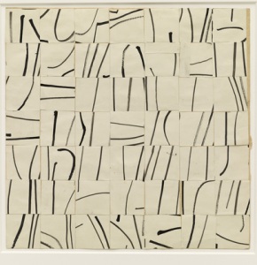
Some notable artists and works. I like Ellsworth Kelly’s gridded, cut-up and reassembled drawings.

Ellsworth Kelly
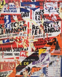
There is Mimmo Rotella’s decollages of advertisements that you might see on the streets where posters are layered and ripped apart. Sort of like a defaced pop art.

Mimmo Rotella
Similar to Rotella’s is Jacques Villegle’s work. Something is very subversive and punk about these works. I like that.

Jacques Villegle
I did love the simplicity of Duchamp’s readymade, “hatrack”, that was hanging from the ceiling. I think most people would see the spider-like look of this work and I think most would enjoy this one cause of its playfullness and it is non-confrontational.

Marcel Duchamp
I enjoyed William Anastasi’s subway drawings. I was doing stuff like this when I was in London. I am not saying I did it first but I feel a connection to this cause of my own personal experience with this mindless exercise. Fun and surprising to make.

William Anastasi's Subway Drawings
There is the systematic digital looking Francois Morellet’s telephone directory works. By just looking at it, it looks like a non-objective minimalism. There is the white one that has the layer of varnish on some areas…white on white…so when you look at it at certain angles you see the differences. I think of Ryman’s white paintings. With the black one’s I think of Ad Reinhart’s black paintings. Those ones are definitely more quiet and subtile. Some of them use hot and sometimes competing color schemes that are more challenging. His work can seem like a combination of a Sol LeWit type of work and op-art. The grid seems to be a very important part of the structure of his work.

A telephone directory work by Francois Morellet
In addition to those works there is Arman’s work in which he collect Claes Oldenburg’s trash. Interesting in an invasion of privacy kind of way. There was a osmotic work by George Maciunas in which spills ink onto a canvas ans lets it spread a soak into the canvas. Marcel Jean and Andre Breton’s drawings were similar. There was Ray Johnson’s mail art and game-like works. There were some exquisite corpse drawings, John Cage compositions and a Nam June Paik’s blank films…well except dust scratches and whatever happened to interfere with the film. Plus there were Deiter Roth’s rotting works.
 Leave a Comment » |
  Comparison/Contrast, criticism, Design and Art, Museums and Galleries | Tagged: aesthetics, Andre Breton, Arman, art, chance, Dada, decollage, deiter roth, drawing, Duchamp, Ellsworth Kelly, Francois Morellet, george maciunas, hat rack, Jacques Villegle, John cage, Marcel Jean, Mildred Lane Kemper Art Museum, Mimmo Rotella, museum, nam june paik, observation, painting, Ray Johnson, sculpture, St. Louis, subway drawings, Surrealism, Washington University, william anastasi |
  Permalink
 Posted by rebeccareilering
October 6, 2009

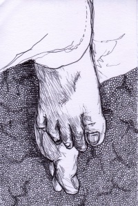
Ben's Feet

Sock Monkey Head

Sock Monkey Torso

Fire Hydrant

Grain Storage Facility
 Leave a Comment » |
  Design and Art | Tagged: art, Belleville, Ben, drawing, Drawing For a Donation, Feet, fire hydrant, Grain Storage Facility, observation, pen, Rebecca Eilering, sock monkey, walking |
  Permalink
 Posted by rebeccareilering
September 29, 2009

A Mess On Top Of A Mess

Carpet Feet

Layers Beneath

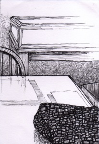
Library Table

Monks Plague
 Leave a Comment » |
  Design and Art | Tagged: A Mess on top of a Mess, art, Artassistance, Carpet Feet, drawing, Drawing For a Donation, Layers Beneath, Library Table, Monk's Plague, pen, Rebecca Eilering |
  Permalink
 Posted by rebeccareilering
September 18, 2009

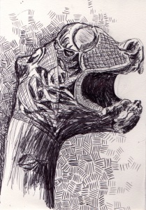
English Book Artifact

Carrots For A Roast

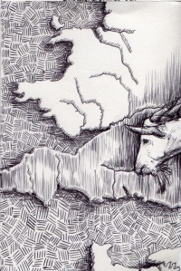
Somali Goat Sneaks Into England

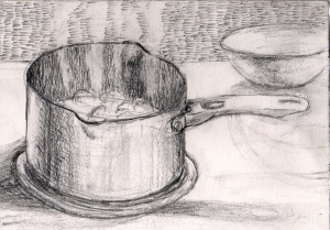
Boiling Water Before Bed

Mother Sleeping

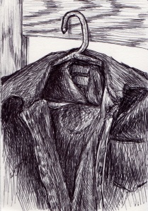
Shirt on a Hanger

Stacked Memories

Topped With A Happy Flower
 Leave a Comment » |
  Design and Art | Tagged: art, Artassistance, drawing, Drawing For a Donation, graphite, observation, pen |
  Permalink
 Posted by rebeccareilering
September 13, 2009

Holy Emergency

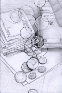
Money Is Magnified

Overgrown and Empty

Promotional Displays

Rotten Apple in the Shadow
 Leave a Comment » |
  Design and Art | Tagged: Artassistance, drawing, Drawing For a Donation, graphite, pen |
  Permalink
 Posted by rebeccareilering
September 10, 2009
Make a donation of 10 dollars or more, I will make a 4″ x 6″ postcard size drawing and send it to you in the mail. The drawing will be a surprise and I will send the drawing within 2 weeks of the donation. The procedes of the money donated with go to assisting my mother with her rent, utilities and food. To find out why I am doing this please visit www.rebeccaeilering.com/artassistance.htm
As I make the drawings, I will post them on here.
Ways to Donate:
1. You may either pay by credit card or through your checking account.
2. I will accept checks through the mail. Please contact me at reileri@yahoo.com so I can give you my mailing address.
So….Put me to WORK!!
To donate:
www.rebeccaeilering.com/artassistanceDonate.htm
For more information about Artassistance:
www.rebeccaeilering.com/artassistance.htm
 Leave a Comment » |
  Design and Art, Ideas, Links, Web | Tagged: art, donation, drawing |
  Permalink
 Posted by rebeccareilering
July 16, 2009
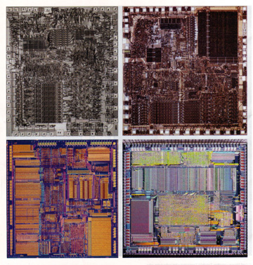
While at the library I cam across a magazine called, Technology Review. It is published by MIT. Specifically, the one I was looking at was the February 2009 issue. I picked it up and just started flipping through the pages. While at it, I came across these wonderful pictures of computer chips; large and detailed. I was pretty stunned at how beautiful they are.
These pictures brought to mind some artists…specifically the painter Peter Halley and Hans Hoffman. Halley’s definitely have a circuit or diagram influence. Being that his paintings started showing up in the 1980s, computer circuitry influence doesn’t seem far fetched. In comparison to an actual chip, they are extremely simplified. However, Hans Hoffman started gaining a reputation as an abstract expressionist painter in the early-mid 20th century. So I doubt a connection could be made to computer chips. I just thought of him because of the hard-edged geometric squares and rectangles that lay in contrast to free-form “painterly” brush strokes. With some of the chips there are some ridged areas and some areas that seem more murky. There isn’t the “push” or “pull” that made the Hoffman paintings so famous.
Here are a couple Halley paintings:


Here are a couple of Hoffman paintings:


Ok, here are the chips I was looking at in the magazine:

L to R top: Intel 8080, Intel 8086; L to R bottom: Intel 386, AMD 386

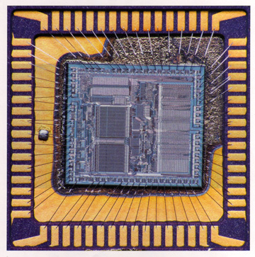
motorola 68000 introduced in 1979. Powered the Macintosh 128K

L: Intel Pentium processor introduced in 1993; R: IBM PowerPC 601 also introduced in 93
The IBM PowerPC chip was developed jointly with Apple and Motorola. This chip was used in Power Macs.

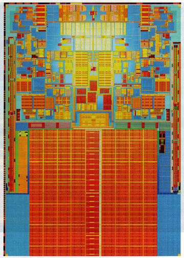
Intel Pentium 4 chip introduced in 2000

2007's Intel Core 2 Duo
I will make note that these chips are in chronological order. The first one was introduced in 1974 and had 5,000 transistors and was the heart of the Altair personal computer. The last one, introduced in 2007, has 410 million transistors and more than one” core” plus a huge data cache. It is amazing how complex these things are and the size of todays chips are tiny in comparison to ones in the past.
 1 Comment |
  Comparison/Contrast, Design and Art, Influences and Inspiration, Thoughts | Tagged: abstract, abstract expressionism, Apple, Hans Hoffman, IBM, Intel, minimalism, MIT, Motorola, neo-geo, painting, Peter Halley, Technology Review |
  Permalink
 Posted by rebeccareilering
July 7, 2009
Last Wednesday I was able to make it over to the new sculpture garden/park in downtown St. Louis called Citygarden. It is a beautiful display of garden, landscape architecture, and sculpture all mixed together to form a landmark that is friendly to the art scholar and kids and adults that just want to have fun and relax. It is just blocks from Busch Stadium and a block from the 8th and Pine Metrolink station.
What a wonderful gift. Here are some pictures of some of the works.

Each square is a different chime sound. Info on this is not on the map but is fun.

Untitled (Two Rabbits) by Tom Claassen
Obviously the kids love to climb on this one. Looks like it is made of marshmallow and is light and soft. However, It is made of bronze. Evidently there are real live rabbits that live in this park. I saw one baby brown rabbit and when I tried to take a picture it scurried into a bush.

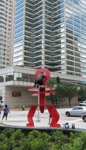
Untitled (Ringed Figure) by Keith Haring
How many art objects can a person climb on without being repremanded? Pretty much all of them here. As you can see, this young man scaled to the top ring to pose for a picture. I am sure this will be a common phenomenon. I believe this is at he corner of 10th and Market. The building in the background is the NBC affiliate, KSDK.

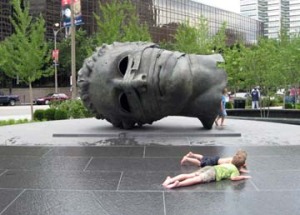
Eros Bendato (Eros Bound) by Igor Mitoraj
This one seems to be a crowd pleaser. This piece is large enough to walk into and one can peer out of the eye sockets. Plus there is the water element in front. Overall, water seems to be a main element of this park. On a hot, humid summer St. Louis afternoon this will be popular.

2 Arcs x 4 230.5 Degree Arc x 5 by Bernar Venet
Who thought a conceptual piece by an artist who’s work is based on math and emotional detachment could be fun? Well, if you can climb on it….simple fun.

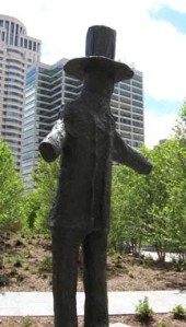
Scarecrow by Donald Baechler
I can see the scarecrow and it is kind of dark and menacing. Sits near the edge of the garden so it seems appropriate. This figure does remind me of Abraham Lincoln with the tall stovepipe hat and tall lanky figure. Actually, it looks like an effigy of Lincoln.

This is Kiera and Julian Walking by Julian Opie
There are two of these animated LED panels in the park. This is just what people are meant to do in this park, go for a stroll.

Looking east. Standing on the rocks below the Northern River Bluffs Band.
There is this arching band that extends across the northern edge of the park. This part has a nice pool with stepping stones and a waterfall. This band is supposed to represent the bluffs. The park is laid out in three bands that represent the geographic features of the region.
Many of the buildings surrounding the park are the glass curtain style and this creates many great reflections.

Twain by Richard Serra
This is probably the most hated sculpture in St. Louis. It is just across 10th street, the western edge of the park. It is not in the park but it looks rather sad and lonely. I really feel bad for this piece. I hope something can be done to maybe expand the park and include this work and reframe it in a new way. Maybe people could feel differently about Twain.
To find out more about Citygarden click here.
To find out more about the Gateway Foundation click here. They funded the project and made this happen. It is in a way a gift to the city. It will be run like any city park.
 Leave a Comment » |
  architecture, Design and Art, Landscape | Tagged: architecture, Bernar Venet, Citygarden, Donald Baechler, garden, Gateway Foundation, Igor Mitoraj, Julian Opie, Keith Haring, Landscape, Richard Serra, sculpture, St. Louis, Tom Claassen, Twain |
  Permalink
 Posted by rebeccareilering
June 5, 2009
Slacking on the blogging. However, I am not slacking in general. I am going to be part of a group show at St. Charles Community College this August. It is their annual Multimedia Exhibition. I am honored to be invited and to be showing with some other awesome St. Louis artists. Plus, I am working on a website for someone I know who has a business. Plus, I might have a few more things in the pipeline. Other than that, I’ve been out riding the bike and enjoying the outdoors. After all, it is summer-time.
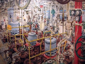
A month or two ago I went to check out some art at the Sheldon Art Galleries. I wanted to see what was up with all the hoopla over the Cindy Tower exhibit. She does plein air paintings of industrial and inner city ruins. Mostly, these are in East St. Louis. Plus, she documents the process.
I have sort of mixed opinion of her. The paintings are nice as paintings. She is obviously a talented painter can really capture all the detail and beauty of the spaces in decay. They actually seem lifelike.

I think the paintings can stand on their own. This is where I feel mixed. She makes videos documenting the process of painting these. Obviously, the process is important to her. However, I question the importance to the viewer. Is the video supposed to demystify the process or is it purely self-indulgent? My opinion is that the documentation is unnecessary and I would like to have some mystery. Honestly, I am not interested in the process. Well, I like to imagine what it is like.
Some part of me feels like it is exploitative too. Here is a white woman going into a perceived dangerous ghetto that is almost 100% non-white. She goes in and makes these paintings and then selling showings and probably selling these paintings to well-off people. She seems interested in showing the decay and the beauty of it. However, is she doing anything to make those areas better? I am not sure. Anyway, does she even want that? I mean, that is her subject and the revival of East St. Louis would take away her subject matter. Of course, this is St. Louis. There are plenty of areas wrought with decay.
Plus she is blatantly breaking the law and brags about it in the videos. I think that sort of makes artists look bad. To me, she is trying to make the paintings a performance but I don’t like the “bragging” about how dangerous the process is. it just seems like a case of a well-off privileged white woman having an adventure (slumming) at the expense of the poor.
I like the paintings and I do find the warped canvases, the dirt and the grime that is on the paintings because of the circumstances of creating them quite nice. They are not these precious and pristine objects. They reflect the subjects well. I am just not sure about the need for the documentation and just giving away the process and not leaving any kind of mystery for my imagination.
Why do I want mystery? In my case when I see an abandoned building or drive through a run down area, being a white woman from crystal clean suburbia, I do have this fascination with decay. It does seem exotic. I do get a sense of wonder because it is different. I get curious and want to explore but I get a sense of fear and anxiety of the unknown. Seeing the paintings lets me see inside and still get that feeling. I guess, I don’t want to the reality because it does expose how well off I am in the world. I guess it makes me feel guilty in finding pleasure in someone else’s pain. What I see between the paintings and the documentation is a tug-a-war or reality and romanticism. However, the mystery is gone.
The paintings with the artist statement with the description of the process was enough for me. The videos….not interested. However, the work does pose some interesting and pressing sociological issues that St. Louis and the nation needs to deal with.
 4 Comments |
  criticism, Design and Art, Museums and Galleries | Tagged: art, Cindy Tower, East St. Louis, galleries, observation, painting, Sheldon Art Gallery, St. Charles Community College, St. Louis |
  Permalink
 Posted by rebeccareilering


 Posted by rebeccareilering